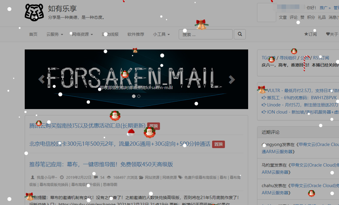
博客好久没有更新干货了!????来了~ 站长想换个场景可以试一试哦!
代码是拔来的,参考:红旗Linux 官网哦~ 分为3部分,分别是html,js,css 代码!
参考站点:https://jike.info/
HTML代码
|
1
|
<div id=“christmas” style=“position: fixed;z-index: 9999;background: rgba(0, 0, 0, .3);”><div style=“position: fixed;left: 0;bottom: 0;width: 100%;text-align: center;”><img src=“https://www.chinaredflag.cn/a_data/image/6.png” style=“width: 100%;height: 100px;z-index: 9999;” alt=“”></div></div>
|
JS代码
依赖jQuery
|
1
2
3
4
5
6
7
8
9
10
11
12
13
14
15
16
17
18
19
20
21
22
23
24
25
26
27
28
29
30
31
32
33
34
35
36
37
38
39
40
41
42
43
44
45
46
47
48
49
50
51
52
|
jQuery(“#christmas”).click(function(){
jQuery(this).hide()
})
for(i=1;i<=200;i++){
top1=900+Math.ceil(Math.random()*100);
left=1+Math.ceil(Math.random()*99);
src=Math.ceil(Math.random()*4);
s=5+Math.random()*13;
h=3+Math.ceil(Math.random()*10);
console.log(src)
newf=jQuery(‘<div class=”flake”></div>’).css({
“-webkit-animation-duration”:s+“s”,
“-moz-animation-duration”:s+“s”,
“-ms-animation-duration”:s+“s”,
“-o-animation-duration”:s+“s”,
“animation-duration”:s+“s”,
“margin-top”:top1+“px”,
“border-radius”:100+“px”,
“background”:“white”,
“width”:h+“px”,
“height”:h+“px”,
“left”:left+“%”,
“z-index”:“1”,
})
jQuery(“#christmas”).append(newf);
}
for(i=1;i<=50;i++){
top1=900+Math.ceil(Math.random()*100);
left=1+Math.ceil(Math.random()*99);
src=Math.ceil(Math.random()*5);
s=5+Math.random()*13;
h=20+Math.ceil(Math.random()*30);
console.log(src)
newf=jQuery(‘<div class=”flake”>’
+‘<img src=”https://www.chinaredflag.cn/a_data/image/’+src+‘.png” style=”width:100%”>’
+‘</div>’).css({
“-webkit-animation-duration”:s+“s”,
“-moz-animation-duration”:s+“s”,
“-ms-animation-duration”:s+“s”,
“-o-animation-duration”:s+“s”,
“animation-duration”:s+“s”,
“margin-top”:top1+“px”,
“border-radius”:100+“px”,
“width”:h+“px”,
“left”:left+“%”,
“z-index”:“1”,
})
jQuery(“#christmas”).append(newf);
}
|
CSS代码
|
1
2
3
4
5
6
7
8
9
10
11
12
13
14
15
16
17
18
19
20
21
22
23
24
25
26
27
28
29
30
31
32
33
34
35
36
37
38
39
40
41
42
43
44
45
46
47
48
49
50
51
52
53
54
55
56
57
58
59
60
61
62
63
64
65
66
67
68
69
70
71
72
73
74
75
76
77
78
79
80
81
82
83
84
85
86
87
88
89
90
91
92
93
94
95
96
97
98
99
100
101
102
103
104
105
106
107
108
109
110
111
112
113
114
115
116
117
118
119
120
121
122
123
124
125
126
127
128
129
130
131
132
133
134
135
136
137
138
139
140
141
142
143
144
145
146
147
148
149
150
151
152
153
154
155
156
157
158
159
160
161
162
163
164
165
166
167
168
169
170
171
172
173
174
175
176
177
178
179
180
181
182
183
184
185
186
187
188
189
190
191
192
193
194
195
196
197
198
199
200
201
202
203
|
#christmas {
position: relative;
width: 100%;
height: 1000px;
overflow: hidden;
/* iOS hack for border radius bleed with transforms */
–webkit–mask–image: –webkit–radial–gradient(circle, white, black);
}
#christmas .ground {
–moz–border–radius–topright: 130px 40px;
–webkit–border–top–right–radius: 130px 40px;
border–top–right–radius: 130px 40px;
position: absolute;
width: 133px;
height: 61px;
left: 0;
bottom: 0;
}
#christmas .ground:before {
–moz–border–radius: 50%;
–webkit–border–radius: 50%;
border–radius: 50%;
content: ” “;
position: absolute;
width: 130px;
height: 100px;
top: 10px;
right: –60px;
background: white;
}
#christmas .ground:after {
–moz–border–radius: 50%;
–webkit–border–radius: 50%;
border–radius: 50%;
content: ” “;
position: absolute;
width: 70px;
height: 70px;
top: 5px;
right: –75px;
background: white;
}
#christmas .tree {
position: absolute;
width: 0;
height: 0;
border–style: solid;
border–color: transparent transparent #23915b transparent;
}
#christmas .tree:before {
content: ” “;
position: absolute;
width: 0;
height: 0;
border–style: solid;
border–color: transparent transparent #23915b transparent;
}
#christmas .tree:after {
content: ” “;
position: absolute;
width: 0;
height: 0;
border–style: solid;
border–color: transparent transparent #23915b transparent;
}
#christmas .tree.left {
left: 28px;
bottom: 78px;
border–width: 0 18px 24px 18px;
}
#christmas .tree.left:before {
top: 10px;
left: –21px;
border–width: 0 21px 28px 21px;
}
#christmas .tree.left:after {
top: 22px;
left: –24px;
border–width: 0 24px 32px 24px;
}
#christmas .tree.left .snow {
–moz–border–radius: 50%;
–webkit–border–radius: 50%;
border–radius: 50%;
–moz–box–shadow: –2px 2px 0 0 white, 2px 2px 0 0 white, –3px 3px 0 0 white, 3px 3px 0 0 white, –12px 14px 0 0 white, –13px 17px 0 1px white, –16px 19px 0 0 white, –9px 16px 0 0 white, –5px 15px 0 2px white, –9px 13px 0 0 white, 6px 15px 0 2px white, 0 13px 0 1px white, 11px 14px 0 1px white, 13px 17px 0 1px white, 15px 19px 0 0 white;
–webkit–box–shadow: –2px 2px 0 0 white, 2px 2px 0 0 white, –3px 3px 0 0 white, 3px 3px 0 0 white, –12px 14px 0 0 white, –13px 17px 0 1px white, –16px 19px 0 0 white, –9px 16px 0 0 white, –5px 15px 0 2px white, –9px 13px 0 0 white, 6px 15px 0 2px white, 0 13px 0 1px white, 11px 14px 0 1px white, 13px 17px 0 1px white, 15px 19px 0 0 white;
box–shadow: –2px 2px 0 0 white, 2px 2px 0 0 white, –3px 3px 0 0 white, 3px 3px 0 0 white, –12px 14px 0 0 white, –13px 17px 0 1px white, –16px 19px 0 0 white, –9px 16px 0 0 white, –5px 15px 0 2px white, –9px 13px 0 0 white, 6px 15px 0 2px white, 0 13px 0 1px white, 11px 14px 0 1px white, 13px 17px 0 1px white, 15px 19px 0 0 white;
position: absolute;
top: 1px;
left: –3px;
width: 6px;
height: 6px;
background: white;
z–index: 1;
}
#christmas .tree.left .snow:after {
–moz–border–radius: 50%;
–webkit–border–radius: 50%;
border–radius: 50%;
–moz–box–shadow: –14px 14px 0 0 white, –15px 17px 0 1px white, –18px 19px 0 0 white, –9px 16px 0 0 white, –5px 15px 0 2px white, –9px 13px 0 0 white, 6px 15px 0 2px white, 0 13px 0 1px white, 12px 17px 0 3px white, 16px 17px 0 1px white, 18px 19px 0 0 white, 11px 20px 0 1px white, 16px 20px 0 1px white, 18px 22px 0 1px white, 21px 25px 0 0 white, –2px 27px 0 1px white;
–webkit–box–shadow: –14px 14px 0 0 white, –15px 17px 0 1px white, –18px 19px 0 0 white, –9px 16px 0 0 white, –5px 15px 0 2px white, –9px 13px 0 0 white, 6px 15px 0 2px white, 0 13px 0 1px white, 12px 17px 0 3px white, 16px 17px 0 1px white, 18px 19px 0 0 white, 11px 20px 0 1px white, 16px 20px 0 1px white, 18px 22px 0 1px white, 21px 25px 0 0 white, –2px 27px 0 1px white;
box–shadow: –14px 14px 0 0 white, –15px 17px 0 1px white, –18px 19px 0 0 white, –9px 16px 0 0 white, –5px 15px 0 2px white, –9px 13px 0 0 white, 6px 15px 0 2px white, 0 13px 0 1px white, 12px 17px 0 3px white, 16px 17px 0 1px white, 18px 19px 0 0 white, 11px 20px 0 1px white, 16px 20px 0 1px white, 18px 22px 0 1px white, 21px 25px 0 0 white, –2px 27px 0 1px white;
content: ” “;
position: absolute;
top: 14px;
left: 0px;
width: 6px;
height: 6px;
background: white;
z–index: 1;
}
#christmas .tree.right {
left: 60px;
bottom: 45px;
border–width: 0 18px 24px 18px;
}
#christmas .tree.right:before, #christmas .tree.right:after {
display: none;
}
#christmas .tree.right .snow {
–moz–border–radius: 50%;
–webkit–border–radius: 50%;
border–radius: 50%;
–moz–box–shadow: –1px 2px 0 0 white, –2px 3px 0 0 white, 2px 2px 0 0 white, 3px 3px 0 0 white, 4px 4px 0 0 white, 6px 6px 0 0 white, 6px 15px 0 0 white, 8px 16px 0 0 white, 10px 16px 0 0 white, 11px 16px 0 0 white, –5px 13px 0 0 white, –7px 12px 0 0 white;
–webkit–box–shadow: –1px 2px 0 0 white, –2px 3px 0 0 white, 2px 2px 0 0 white, 3px 3px 0 0 white, 4px 4px 0 0 white, 6px 6px 0 0 white, 6px 15px 0 0 white, 8px 16px 0 0 white, 10px 16px 0 0 white, 11px 16px 0 0 white, –5px 13px 0 0 white, –7px 12px 0 0 white;
box–shadow: –1px 2px 0 0 white, –2px 3px 0 0 white, 2px 2px 0 0 white, 3px 3px 0 0 white, 4px 4px 0 0 white, 6px 6px 0 0 white, 6px 15px 0 0 white, 8px 16px 0 0 white, 10px 16px 0 0 white, 11px 16px 0 0 white, –5px 13px 0 0 white, –7px 12px 0 0 white;
position: absolute;
top: 0;
left: –3px;
width: 6px;
height: 6px;
background: white;
}
#christmas .flake {
–webkit–animation: snow infinite linear 2s;
–moz–animation: snow infinite linear 2s;
–ms–animation: snow infinite linear 2s;
–o–animation: snow infinite linear 2s;
animation: snow infinite linear 2s;
position: absolute;
width: 1px;
height: 1px;
}
@–webkit–keyframes snow {
0% {
–moz–transform: translateY(–1500px);
–ms–transform: translateY(–1500px);
–webkit–transform: translateY(–1500px);
transform: translateY(–1500px);
}
100% {
–moz–transform: translateY(0);
–ms–transform: translateY(0);
–webkit–transform: translateY(0);
transform: translateY(0);
}
}
@–moz–keyframes snow {
0% {
–moz–transform: translateY(–1500px);
–ms–transform: translateY(–1500px);
–webkit–transform: translateY(–1500px);
transform: translateY(–1500px);
}
100% {
–moz–transform: translateY(0);
–ms–transform: translateY(0);
–webkit–transform: translateY(0);
transform: translateY(0);
}
}
@–ms–keyframes snow {
0% {
–moz–transform: translateY(–1500px);
–ms–transform: translateY(–1500px);
–webkit–transform: translateY(–1500px);
transform: translateY(–1500px);
}
100% {
–moz–transform: translateY(0);
–ms–transform: translateY(0);
–webkit–transform: translateY(0);
transform: translateY(0);
}
}
@keyframes snow {
0% {
–moz–transform: translateY(–1500px);
–ms–transform: translateY(–1500px);
–webkit–transform: translateY(–1500px);
transform: translateY(–1500px);
}
100% {
–moz–transform: translateY(0);
–ms–transform: translateY(0);
–webkit–transform: translateY(0);
transform: translateY(0);
}
}
|
© 版权声明
THE END